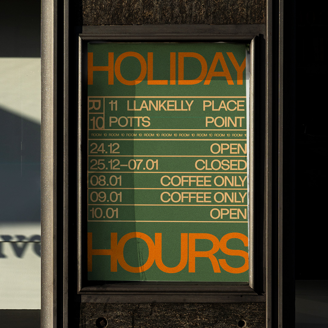
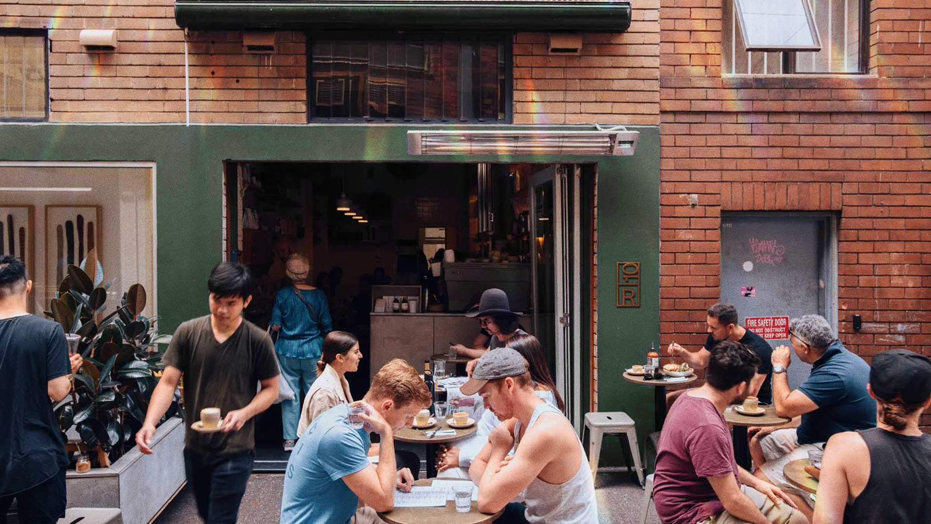
Room10 Potts Point
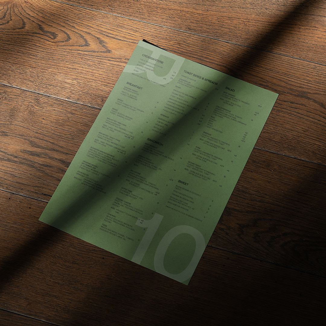
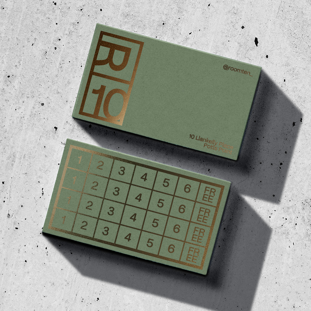
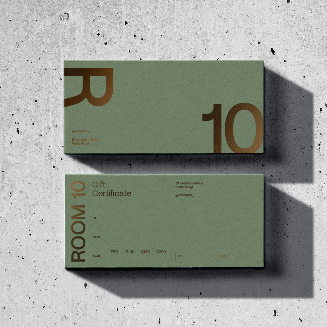
Consistency of brand across many different touchpoints was paramount to the project's success. Starting with a humble Colorplan stock and ending with sturdy, all-weather umbrellas, the not-quite-army mid-green was the uniting glue of the split wordmark.
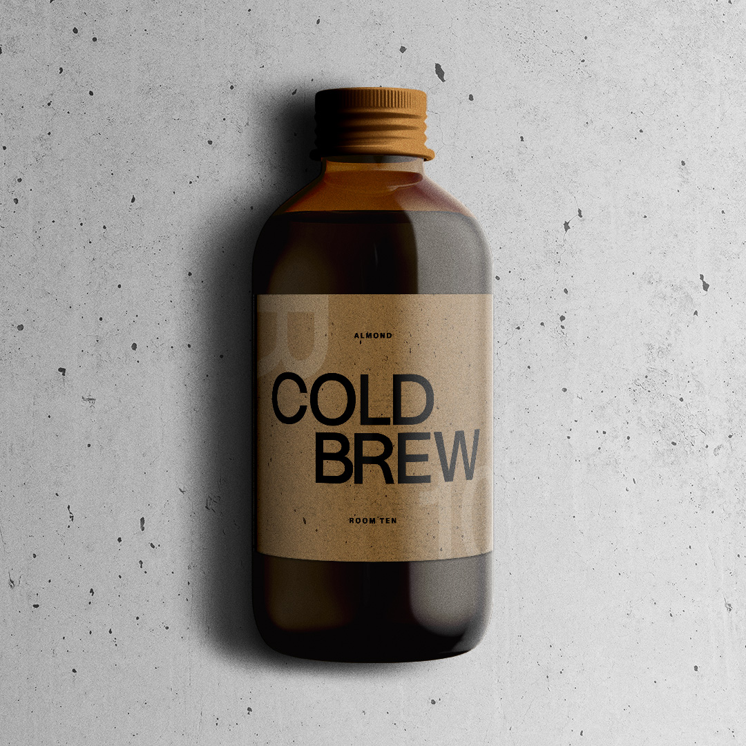
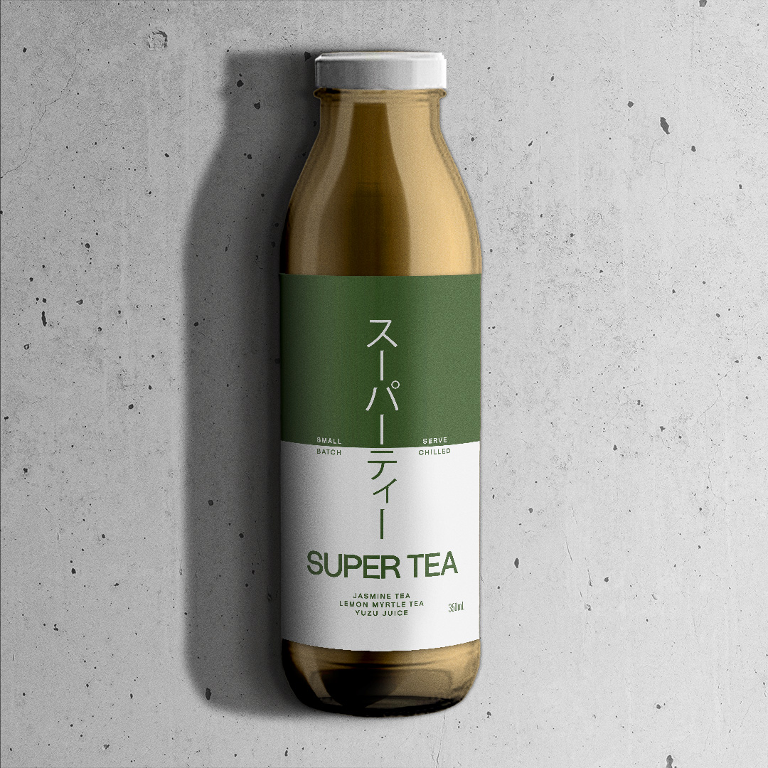
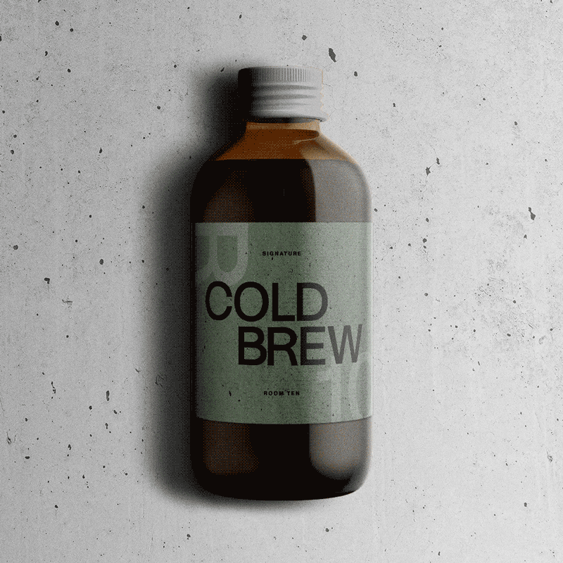
Expanding their lineup of takeaway products – Cold Brew and Supertea were a huge part of the refresh. While these needed a slightly more FMCG-friendly design, we still wanted to keep the minimal Japanese aesthetic front and centre.